Longo’s Mobile App

The Challenge
As part of our capstone project at Humber, we were assigned the research topic of “Food Exploration: Weekly Musts” for the Longo’s Mobile App and their physical store. The study was conducted between January 2020 to February 2020.
As a UX team collaborating with Longo’s, we were tasked with exploring the challenge of blending technology into the physical store to make the shopping experience seamless for Longo’s customers.

Contributions
Team
Yasir Hussain, UX Designer
Io Qiu, UX Designer & Sprint Master
Husain Zaidi, UX Designer
James Kim, UX Researcher
Individual Contributions
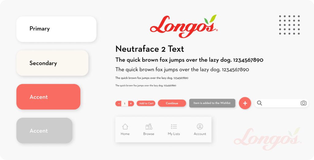
- Built design guide according to Longos branding
- Ironed out and finalized User Task Flows
- Low and High Fidelity Wireframing Designs
- Moderated some of the design thinking activities

Solution
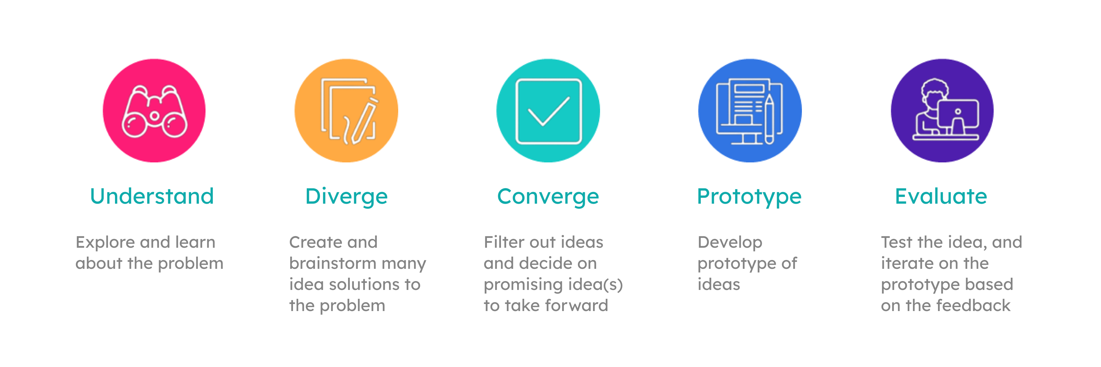
The goal of the activity was to work with an Agile Design Process approach where the work is chunked into days of the week for the 5 day sprint.
We conducted user research with regular shoppers, store staff and the managers at the Longos store to gain detailed insights about the customer journey of the shoppers, which allowed us to understand the pain points, areas for improvement and opportunities.
During the sprint cycle, we consolidated our research findings, conducted design thinking activities. Then went on to brainstorm for solutions followed by low fidelity prototyping and user testing. After obtaining feedback from user testing, we incorporated changes in our design and created the high fidelity prototype.

Project Aspects
User Experience
Interface Design
Product Design
Interaction Design
Agile Design Sprints

Output
User Research Analysis Report
Design Process Documentation
Wireframes
User Testing Report
Minimum Viable Product Prototype
Business Objectives
- Devising new solutions for the retail space to deliver an efficient shopping experience through incremental sales and growing brand loyalty.
- Increase Customer Acquisition.
- Increase Customer Engagement – Longo’s Thank You Rewards participation.
Project Timeline
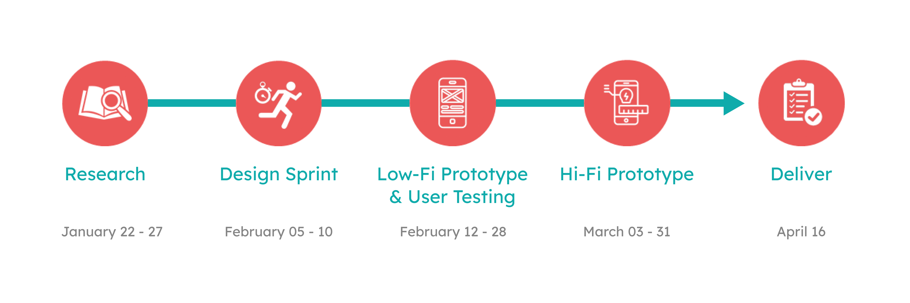
Detailed Overview
Phase 1
Research
Week 2
January 27 – February 2
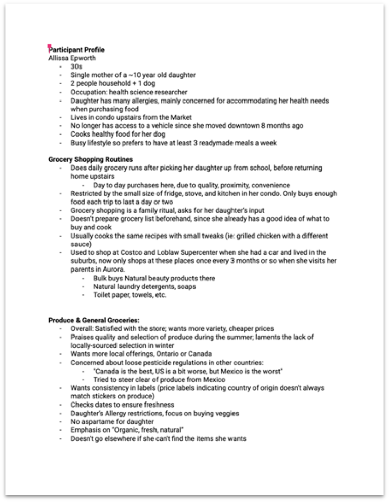
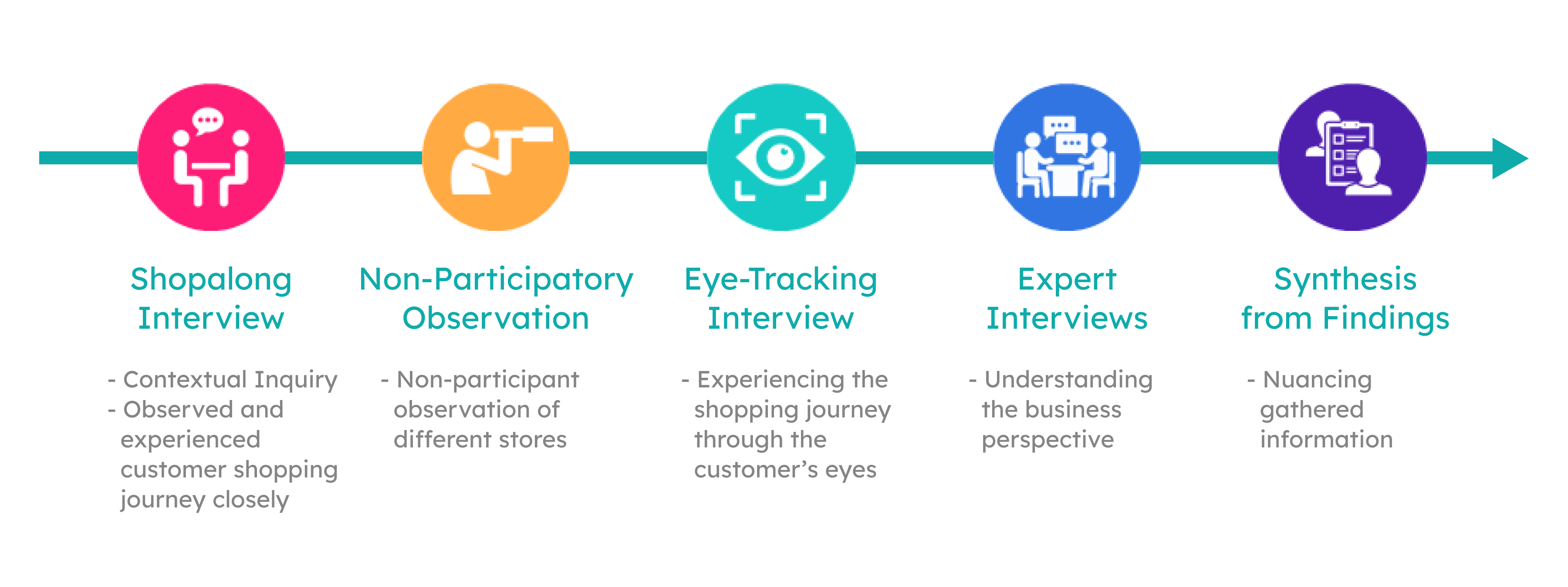
Eye Tracking and Shop-along Interview
Participant Interview
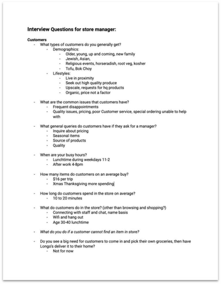
Expert Interviews with Staff and Store Manager
Non-Participatory Observation
Phase 2
Design Sprint Cycle
Week 3
February 12 – 16
Day 1: Understand & Define
– Primary Research Synthesis
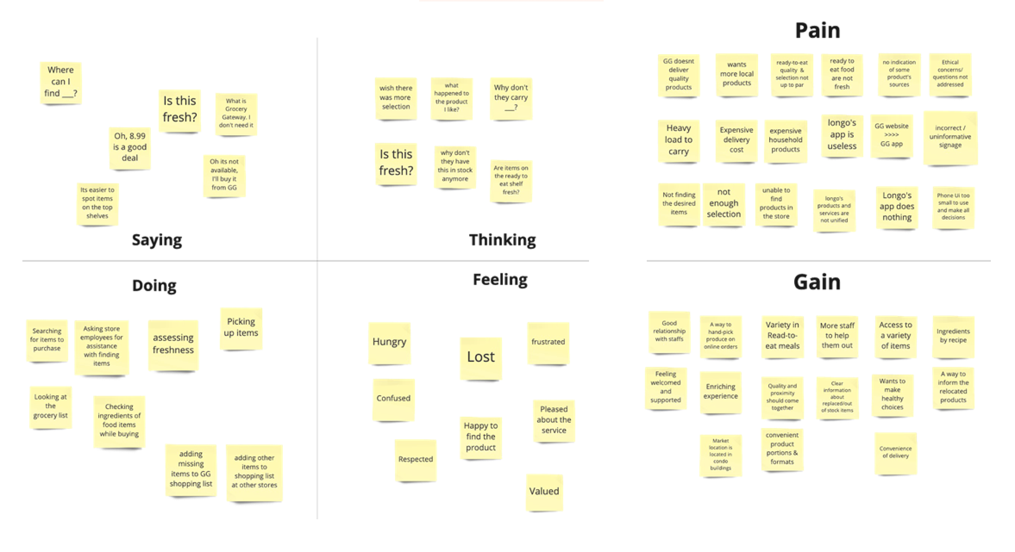
– Persona Creation & Empathy Map
– Customer Journey Mapping
– Problem Identification & HMWs
Day 2: Sketching & Ideation
– Crazy 8s & Big Idea Vignette
Day 3: Deciding
– Prioritization Grid
– Finalizing Solution
– Task Flows
– Wireframe Sketching
Day 4: Prototyping
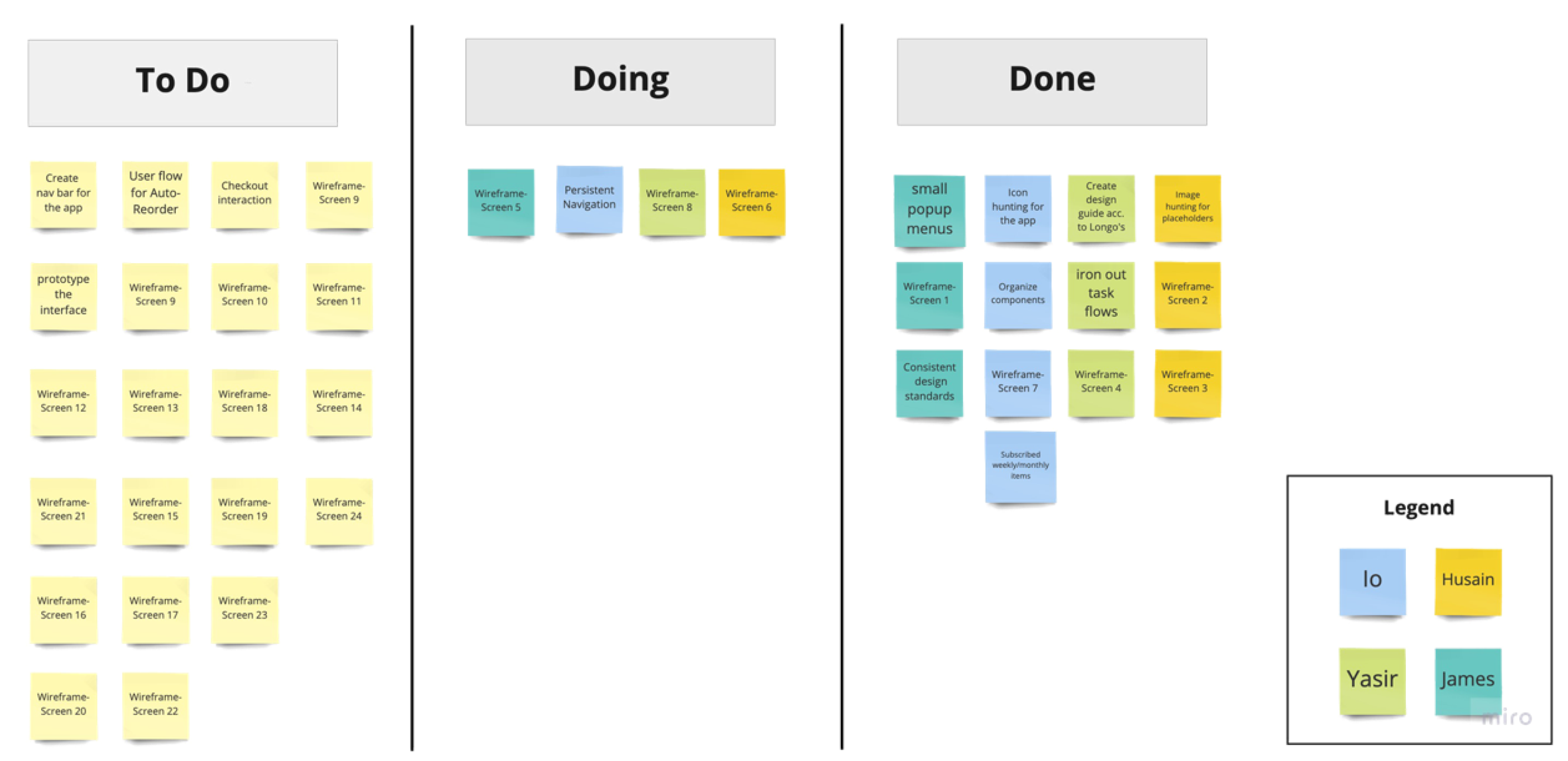
– Kanban Board
– Prototype Playback
Day 5: User Testing
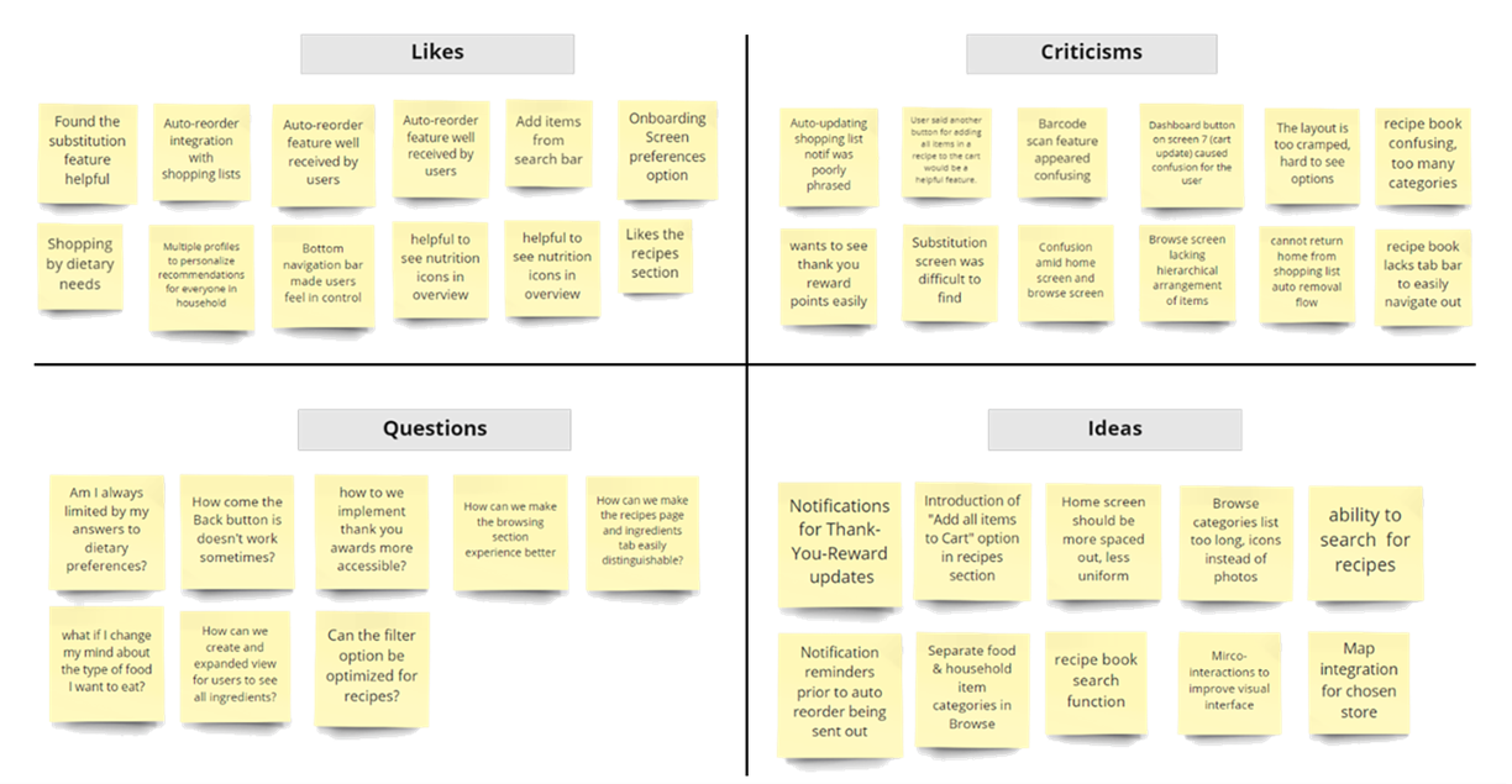
– Feedback Grid
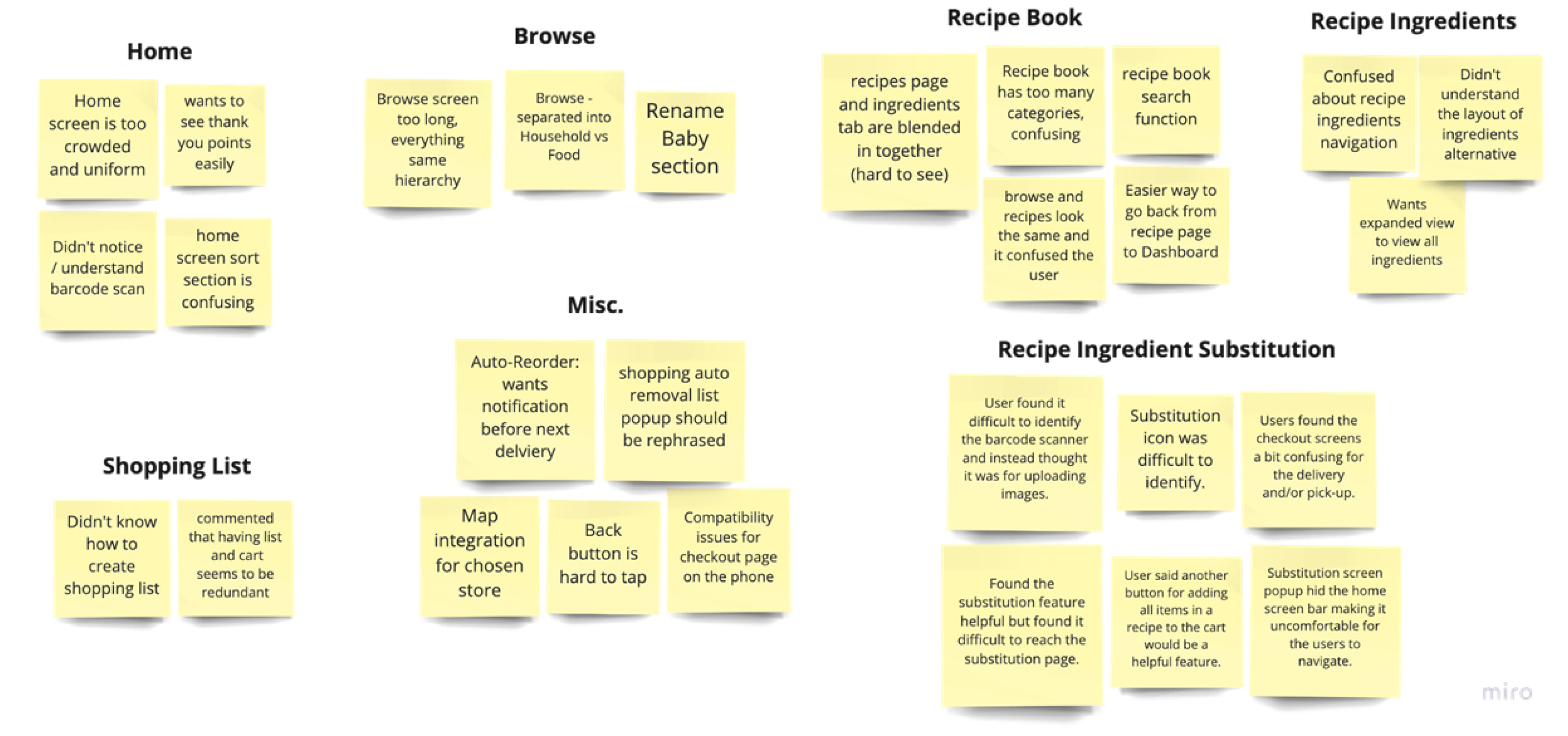
– Clustering Feedback
Phase 3
Retrospective
Week 4
February 16 – 20
Consolidation of Sprint findings
Sprint Package Presentation Deck
Phase 4
Reflection
Week 5
February 20 – April 1
High-Fidelity Wireframing
Reflections
Client Presentation Deck
The Detailed Process
Introduction
Despite the rapid shift to online retail, the vast majority of people still prefer shopping groceries in-store over online. Although recent trends show that the number of people shopping for food online are increasing significantly each year, it has also changed many consumers’ attitudes and habits towards buying groceries online. However, majority of Canadians prefer shopping in-store and said that the ability to quickly and easily navigate through the grocery shop would significantly improve their current in-store shopping experience. They particularly prefer micro-trips for shopping rather than bulk buying, indicating a preference for food that is convenient, casual and integrated into their lives as a frequent chore rather than being a big shopping task.
Longo’s is trying to leverage existing technology to further enhance the experience of customers shopping in their departmental stores through bridging the gaps and alleviating the pain points in the customer journey for achieving their business objectives. Our team was tasked with the research topic of Food Exploration: Weekly Musts, which focuses on opportunities for routine grocery purchases. In order to conduct research and propose a digital solution for the problem, we were presented with the following question:
“How might we improve Longo’s guests’ grocery shopping experience and help them discover new products while increasing brand loyalty and sales?
Longo’s is a chain of Canadian retail supermarkets, founded by Longo brothers in the year 1956. The chain has a total of 36 stores, most of them being in the Greater Toronto and Hamilton Area. They are a prominent name with a strong brand presence in Canada.
Research Process
Primary Research
Our primary research location was a medium convenience format grocery store in a residential housing in Downtown Toronto. The building with its appealing interior design along with a historical significance provides an upscale shopping experience for visitors.
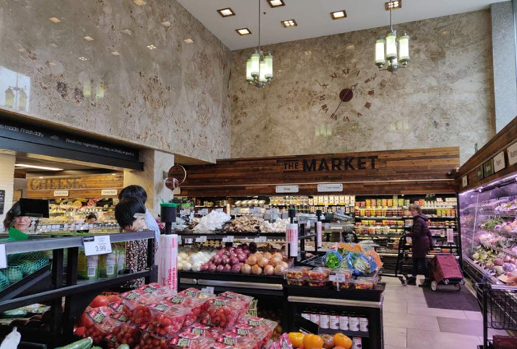
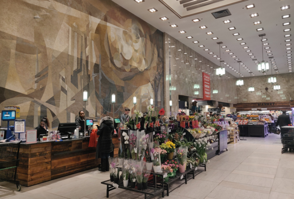
The Market by Longo’s at Imperial Plaza, 111 St. Claire Avenue, Toronto
Primary Research Process
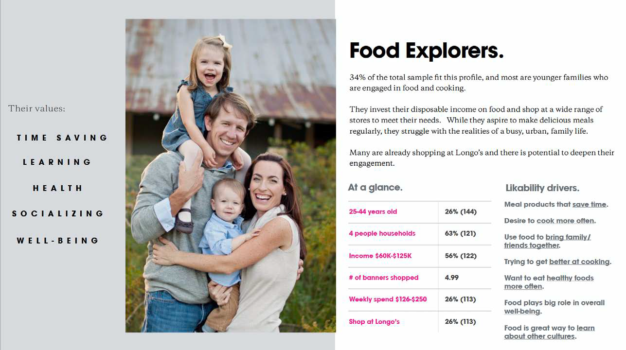
Target Audience Psychographics
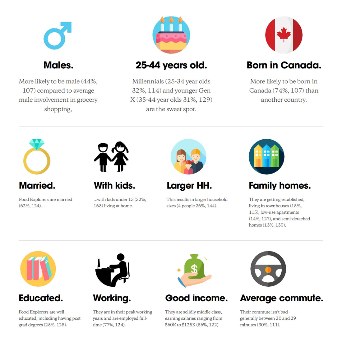
Target Audience Demographics
Participant Interview Discussion Guide
The participants being frequent customers of Longos provided valuable insights. The interview guide was classified among the following categories:
- Grocery Shopping Routines – Their routine, meal preparation and purchase habits.
- Produce & General Groceries – Wants, needs and concerns w.r.t. local produce.
- Regular Staples – Items that the participants frequently purchase.
Readymade Meals – Items that they purchase to substitute their regular meals.
Interview 1: Shop Along
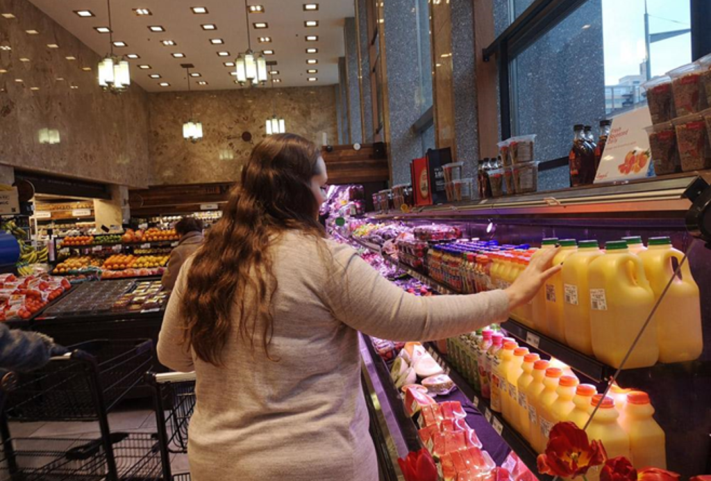
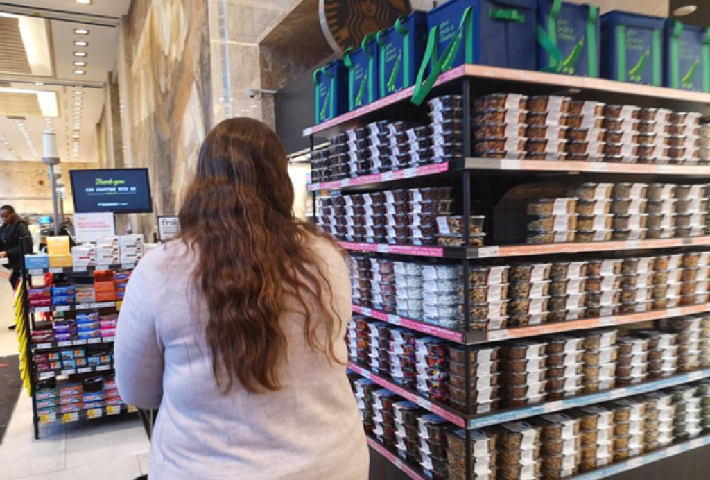
Participant 1: Female, 30s, Single Mother
“My daughter is a picky eater when it comes to vegetables, I have to be very selective”
“I buy lot of the same food items, but I do like to try new things from time to time”
“Being a resident, coming down here to shop is very convenient and saves time”
Interview 2: Eye Tracking Interview
Participant 2: Female, 30s, Vegetarian
Eye Tracking Insights
“I always look for the date that’s furthest away.”
“Actually it’s funny I used to have a different one, then they ran out of stick, so I bought a different one and stuck with it. Sometimes by switching we end up with the Lonog’s brand.”
“Hey George! Did you like our Christmas cookies?”
“No crumpets! No breakfast for me. I’ll try again tomorrow. Maybe if I see someone I’ll ask if they have it.”
“We live upstairs and they have everything we need, if they don’t have something we use Grocery Gateway, if Gateway doesn’t have it then we go to the Loblaws down the street.”
“And Ground beef! We always get the Extra Lean just because it’s less fat.”
“The shallots are usually here on this shelf but today I just can’t seem to find them!”
– Participant tried to find items by glancing through the shelf labels.
– Participant generally glances at items at eye level.
Expert Interview Discussion Guide
The participants being frequent customers of Longo’s provided valuable insights. The interview guide was classified among the following categories:
- Grocery Shopping Routines – Their routine, meal preparation and purchase habits.
- Produce & General Groceries – Wants, needs and concerns w.r.t. local produce.
- Regular Staples – Items that the participants frequently purchase.
Readymade Meals – Items that they purchase to substitute their regular meals.
Expert Interview 1: Customer (Regular Customer)
- Diverse demographics: Adults, seniors, up and coming professionals, young families
- Prioritize quality and upscale experience
- Besides shopping, guests also connect with staff and chat, use the wi-fi and hang out
- Average time in store 10-20 minutes
- Average spending $16 per trip
- Busy hours: Weekdays Lunchtime & After work
- General queries: pricing, seasonal items, product sourcing
- Common issues: Quality, pricing, poor Customer service, special ordering requests
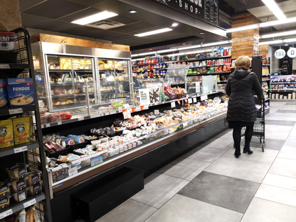
Expert Interview 2: Staff (Ready to Eat Section)
- In general hot bar is very popular, but, cold bar sides are not
- Premade sandwiches & Salad are popular choice for lunch items
- Guests expressed their concern for freshness of the food products in the both hot and cold bars (They are not aware of the timers)
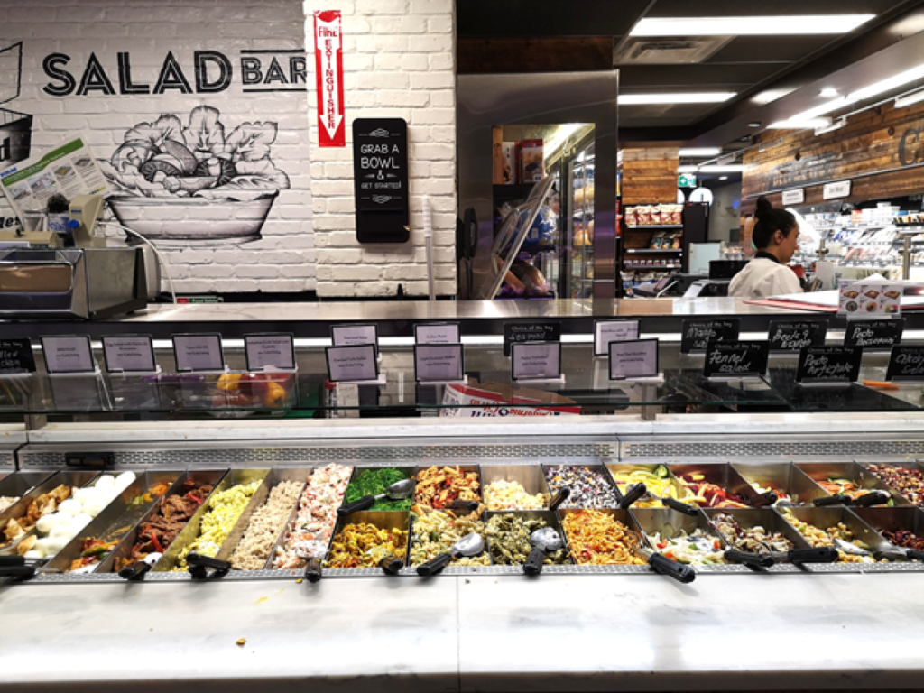
Expert Interview 3: Business & Operation (Store Manager)
Diverse demographics: Adults, seniors, professionals, young families
Busy hoursLunchtime during weekdays 11am-2pm
After work 4pm-8pmGuests spend on average 10 to 20 minutes in the store
Most popular sellers are avocados, bananas, and bread
Interestingly, most profitable items are grapes
Prices change during different seasons – in season items are cheaper

The Design Sprint Cycle
Day 1: Understand and Define
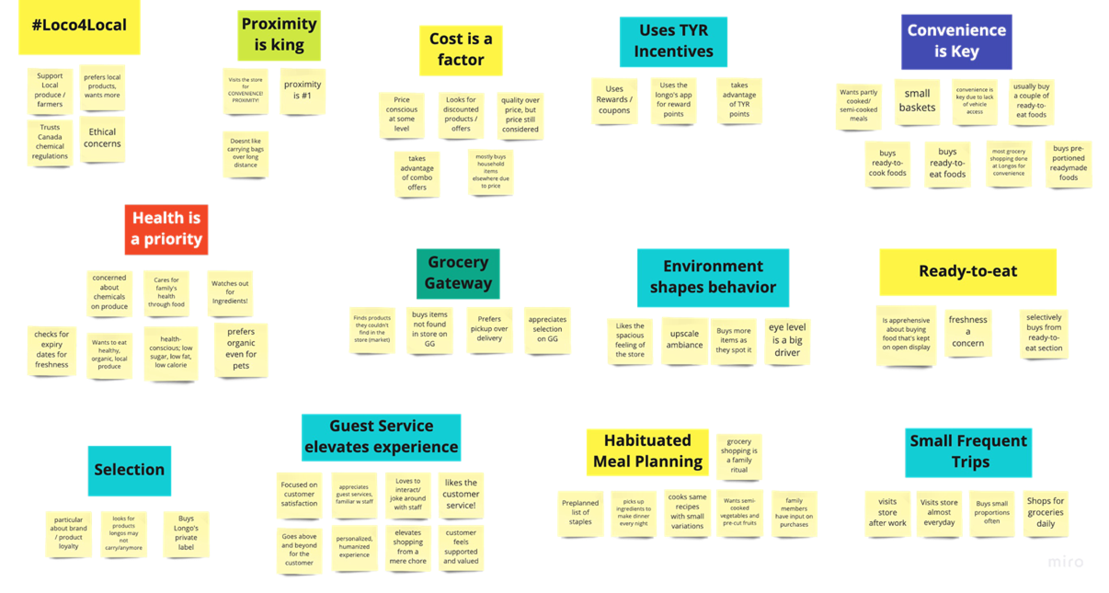
Primary Research Synthesis
Emergent Themes
Proximity is king
Habituated Meal Planning
Convenience is key
Environment shapes behaviour
Health Conscious first then price focused
Guest services elevate experiences
Uses “Thank You Rewards” (TYR) Incentives
Like supporting local products
From the themes identified, we found three which had the most impact on Longo’s guests:
Proximity
Convenience
Health Conscious
Persona Creation
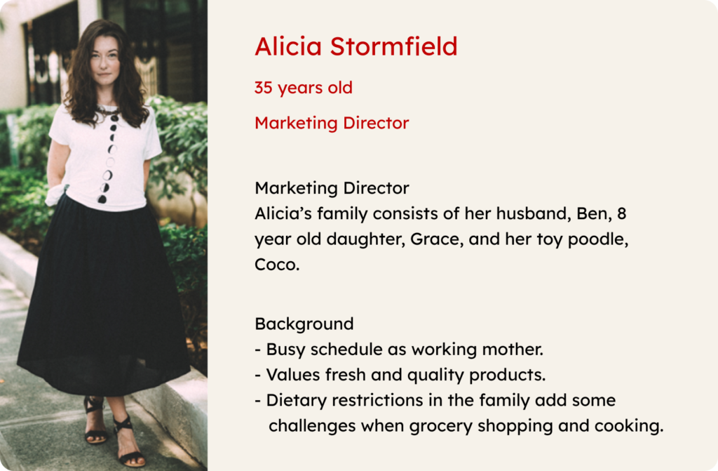
Empathy Map
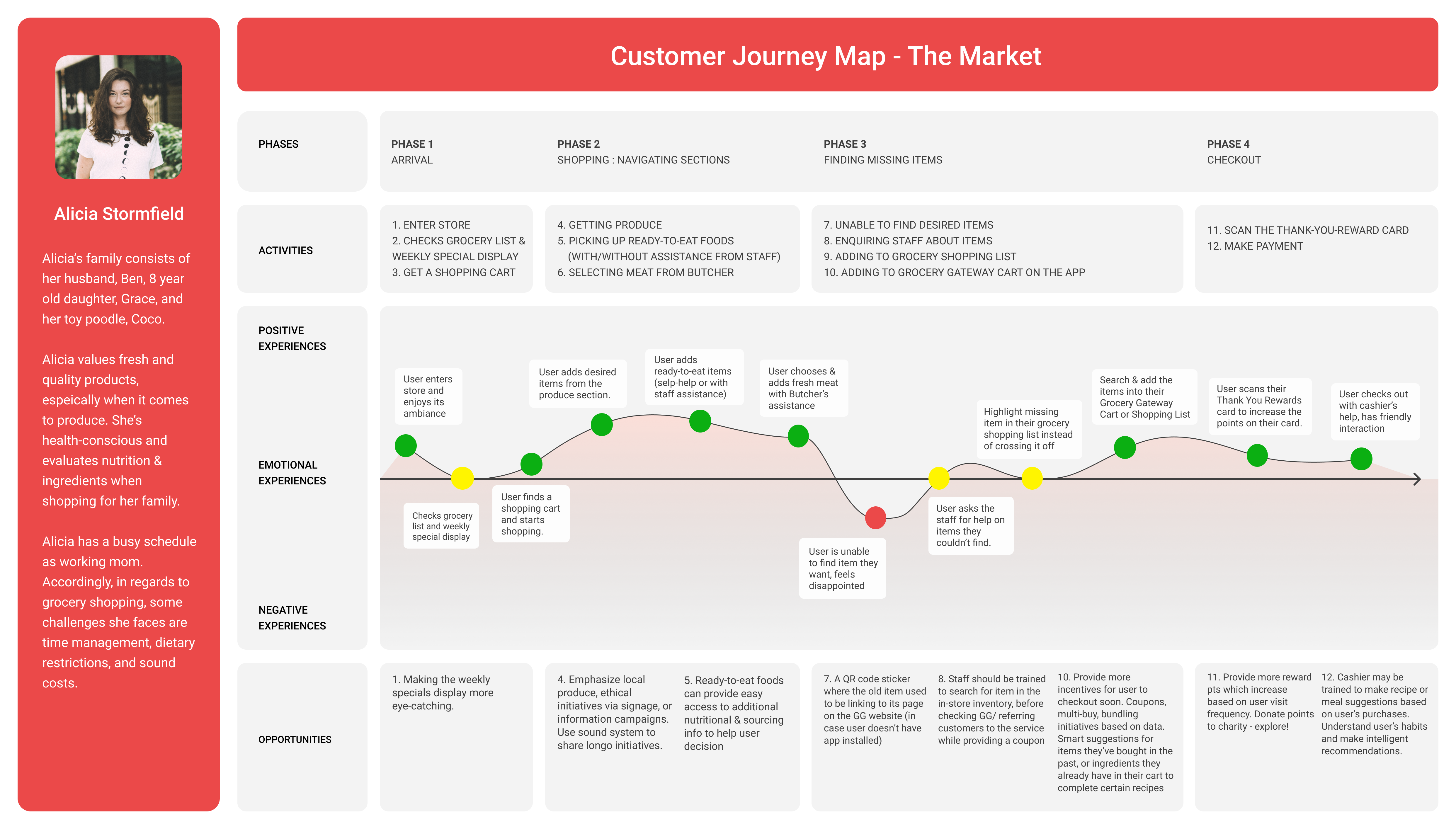
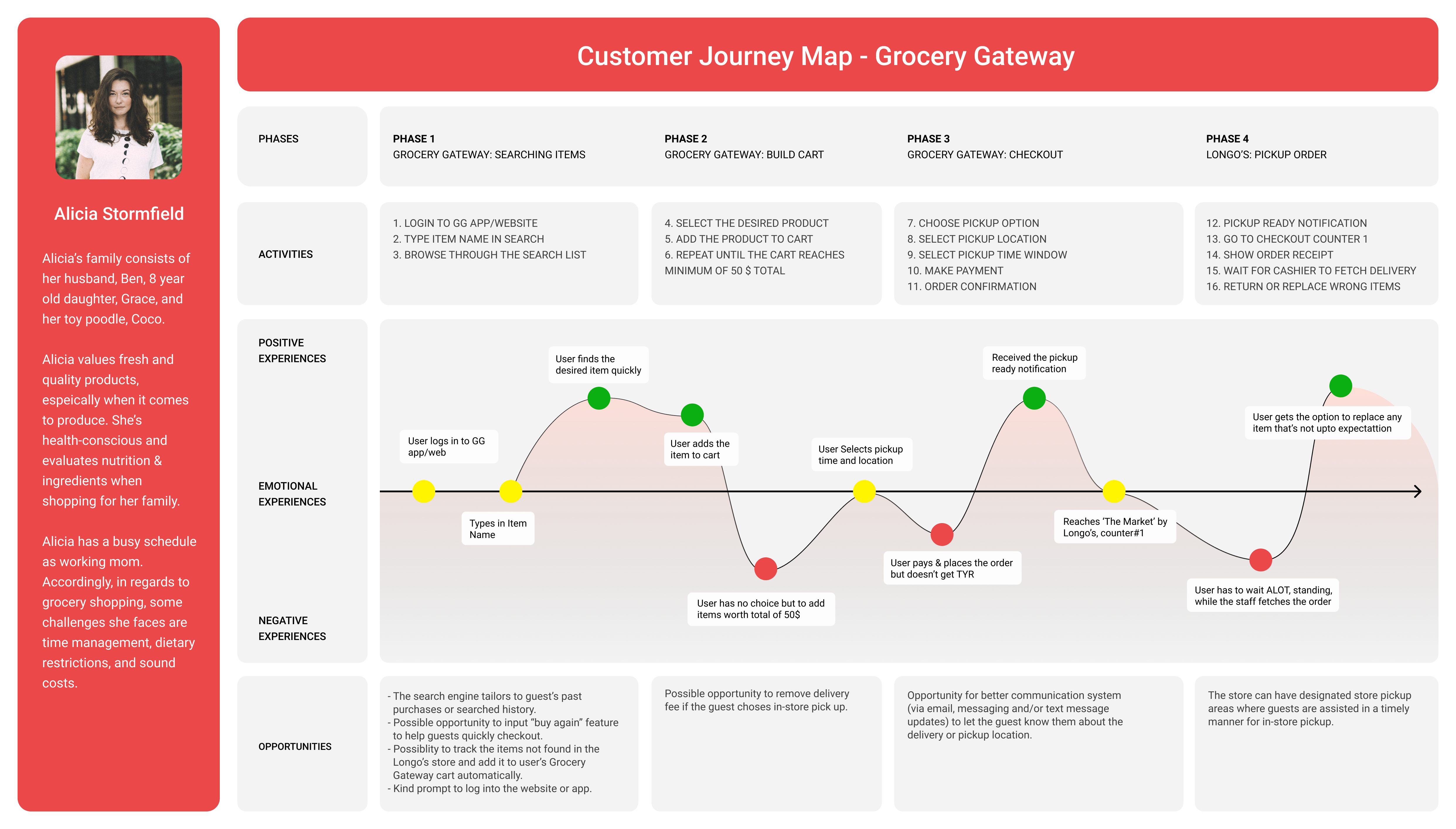
Customer Journey Map
Please tilt screen and zoom for best viewing experience.
The Problem
Convenience is the first priority for our time-starved target users
It is difficult shopping for guests who have dietary restrictions
Lack of selection in store creates the a hassle of remembering the items and placing the order online or purchasing from elsewhere.
Discrepancy between online and in-store shopping experience
Need to improve the online experience to be more enjoyable and integrated into the store experience as customers:
– Are unable to place orders if the cart value is lesser than $50 on Grocery Gateway.
– Need to check items online for specific stores.
– Want a seamless in-store pickup experience.
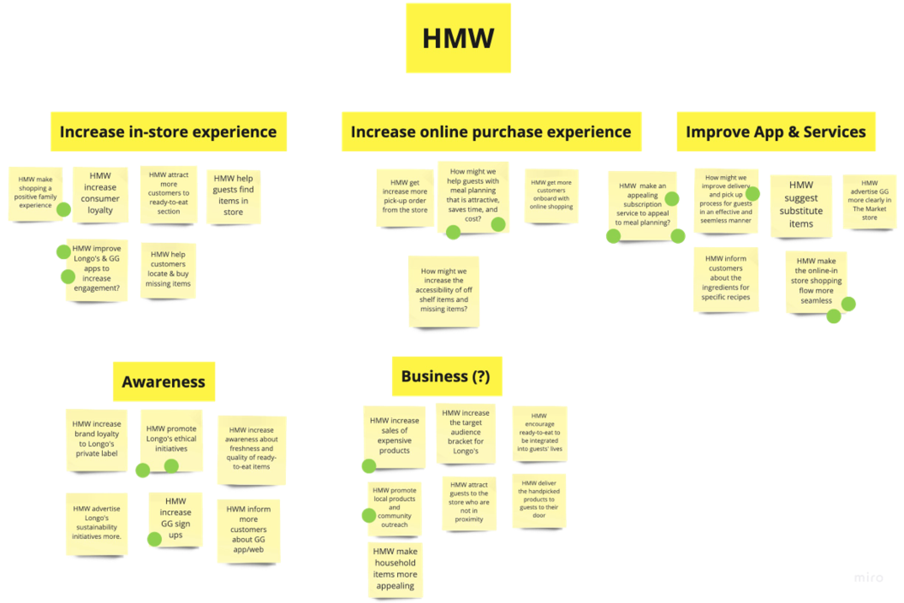
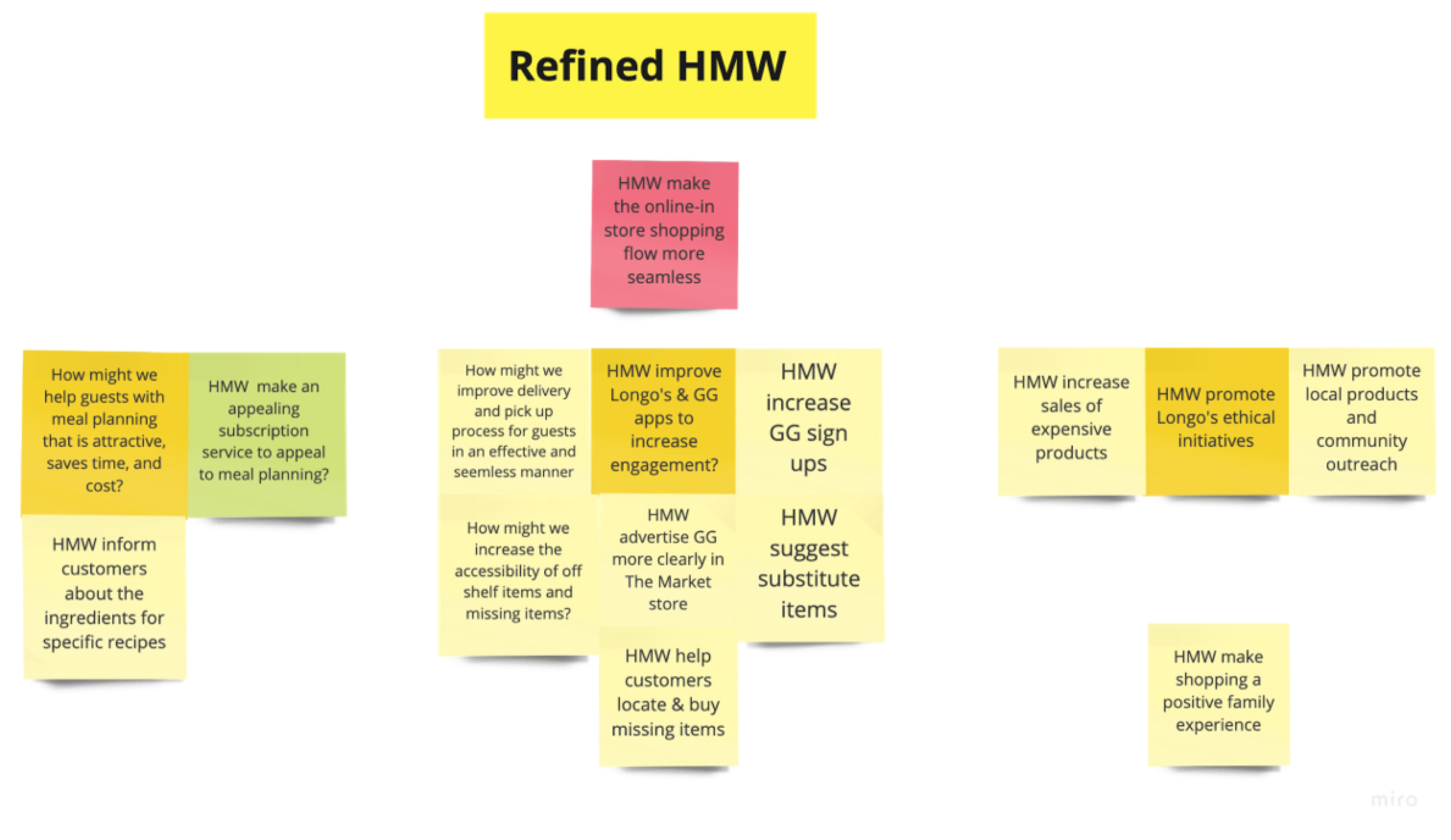
How Might We Statements
How Might We Statements
- Adhere to timeboxing
- Keeping an open mind: observe, absorb, understand
- Uncovering main area of opportunity – Creating seamless experience between instore and online store
Day 2: Sketch
After defining our problems, we did brainstorming on Day 2! We started the day with Lightning Demos.
- Lightning Demos
We took 20 minutes to research all the existing solutions that are out there, and then spent 3 minutes on comparing the pros and cons of each solution. - Crazy 6
Next we did Crazy 6 activity, in which each team member quickly sketched 6 ideas. And then we pinned all the ideas on the board and discussed them one by one. - Brainstorming
After being inspired from each other’s ideas from Crazy 6, We took 10 minutes to brainstorm any more solutions that might have triggered from the shared sketches. This would ensure that we leave no idea behind. We posted all of these compiled ideas on the Big Idea Board, that would later be used to inform the prioritization grid.


Big Idea Vignette
We initially planned on voting on the sketched ideas, but all the ideas that the team came up with were very coherent to each other. It was not the matter of which one to choose over the other, as most of the potential solutions could exist together. So we decided to list down all the ideas and objectively discuss their viability with respect to their impact on customer’s experience.
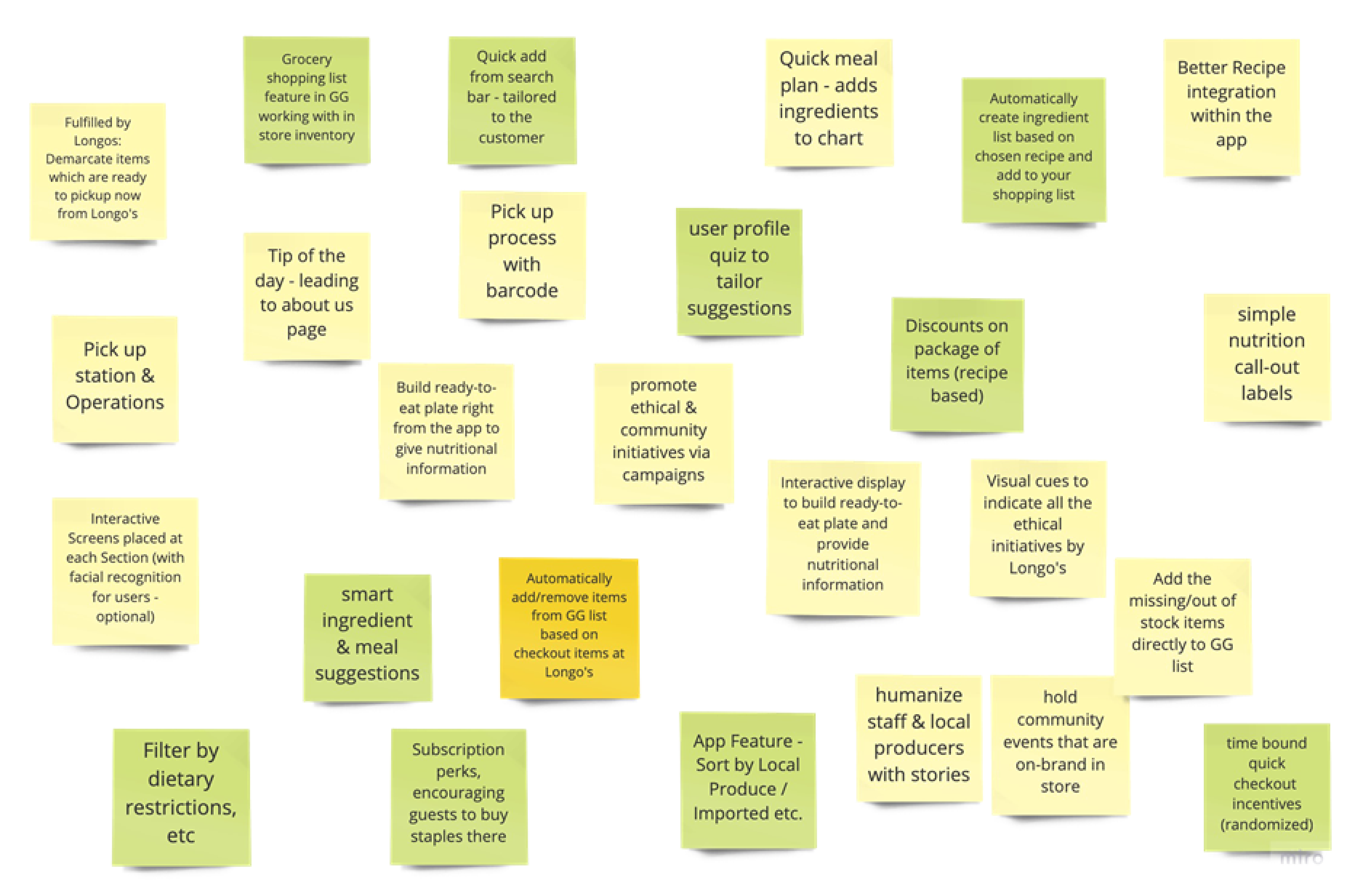
- It was interesting to see how ideas can come together and built on top of each other.
- Giving each member an equal opportunity to speak and share their ideas.
- Big Idea Vignette was very helpful to manage time efficiently and ensured that we did not overthink about the ideas.
Day 3: Decide
- We started Day 3 with discussing the value and feasibility of ideas on the Big Idea board.
- Each idea was discussed for 3 minutes each. Each member expressed concerns regarding each idea. And based on the discussion the team placed them on the prioritization grid.
- The most feasible ideas are then selected and the team discusses the assumptions behind the solution and the questions that we might want to validate in the future.
- Then the team voted on what ideas to prototype in Sprint 1, and the rest will be executed in phase 2.
- Finally, we detailed out the ideas into tangible artifacts to (task-flows and wireframes) prototype the next day.
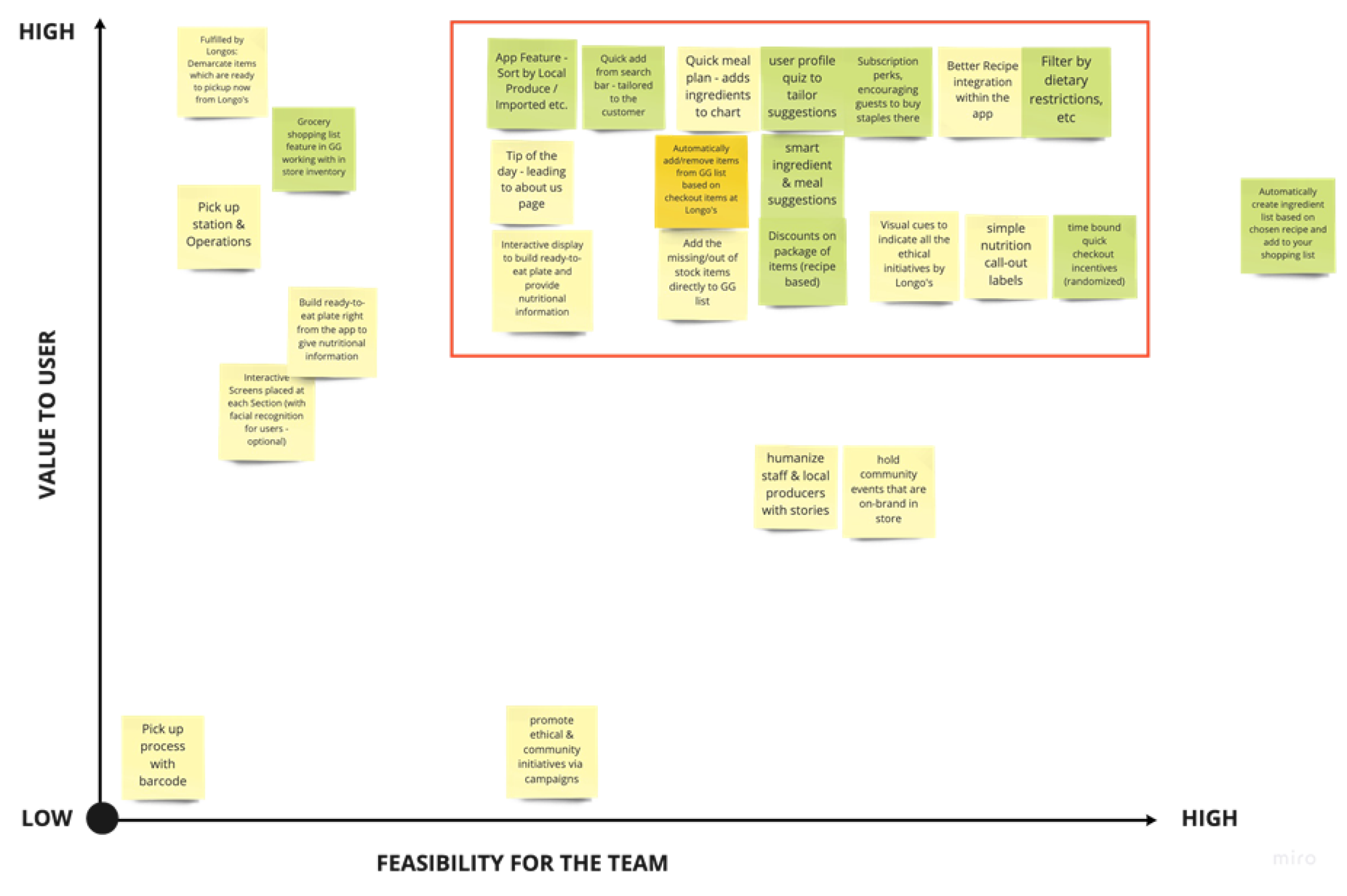
Chosen Solutions
Meal Planning
Integrating better meal planning in Longo’s app, through smart recipe suggestions and add-to-cart ingredients.
Integrating In-store and Online Experience
QR codes at the aisle for missing products. Gives user the ability to add missing products in-store to Longo’s app shopping cart directly.
Smart Shopping List
Automatically removes items from the Longo’s app shopping list as the user checks it out from the store.
User Profiles
Ability to create multiple user profiles in Longo’s app to accommodate household members with differing dietary preferences. Each profile will get personalized search results and recommendations.
Task Flow Sketches
We all individually came up with our ideas for the task flow. After reviewing each of them, we combined them to create a master user flow.
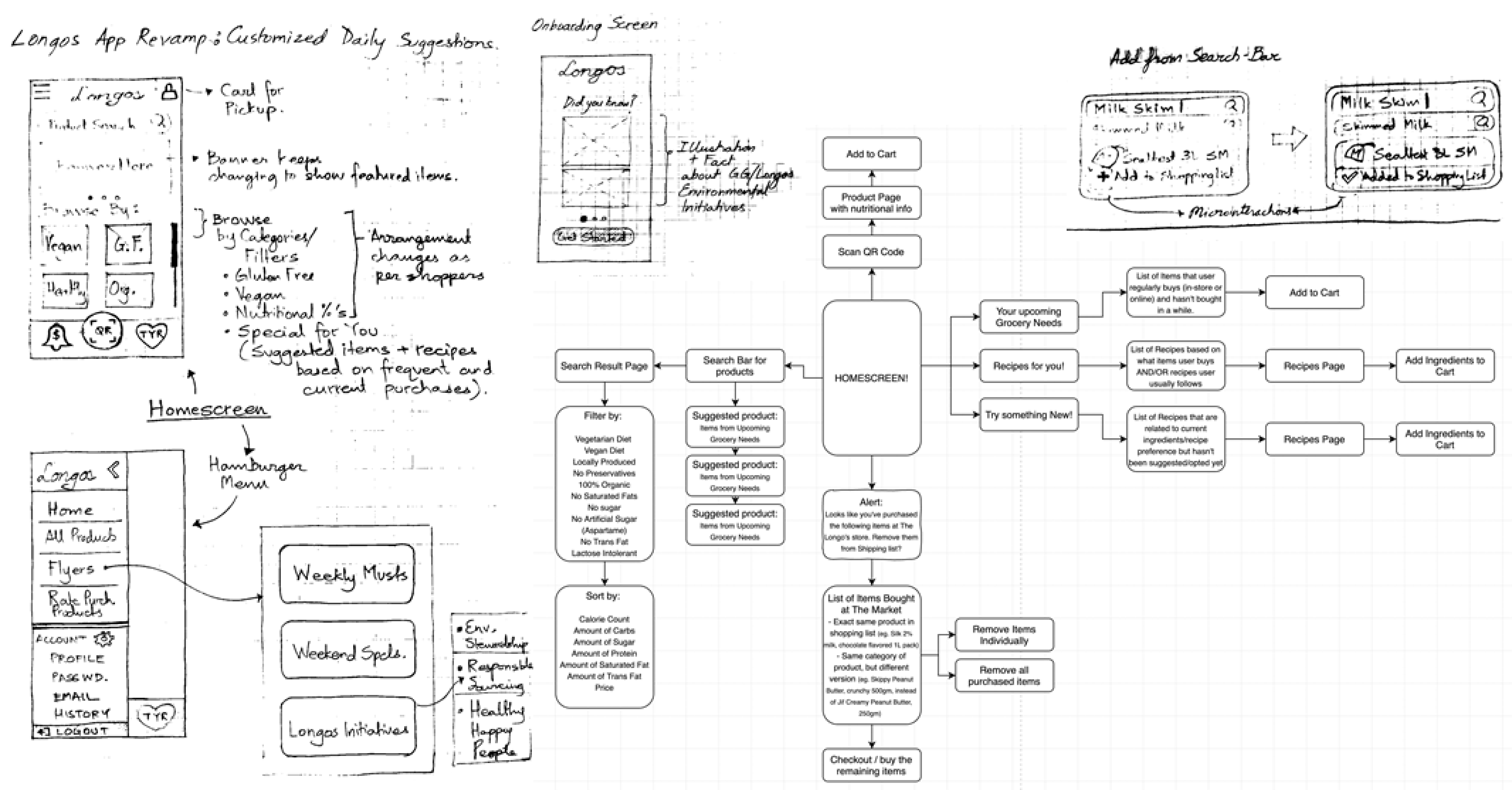
Task Flow Sketches
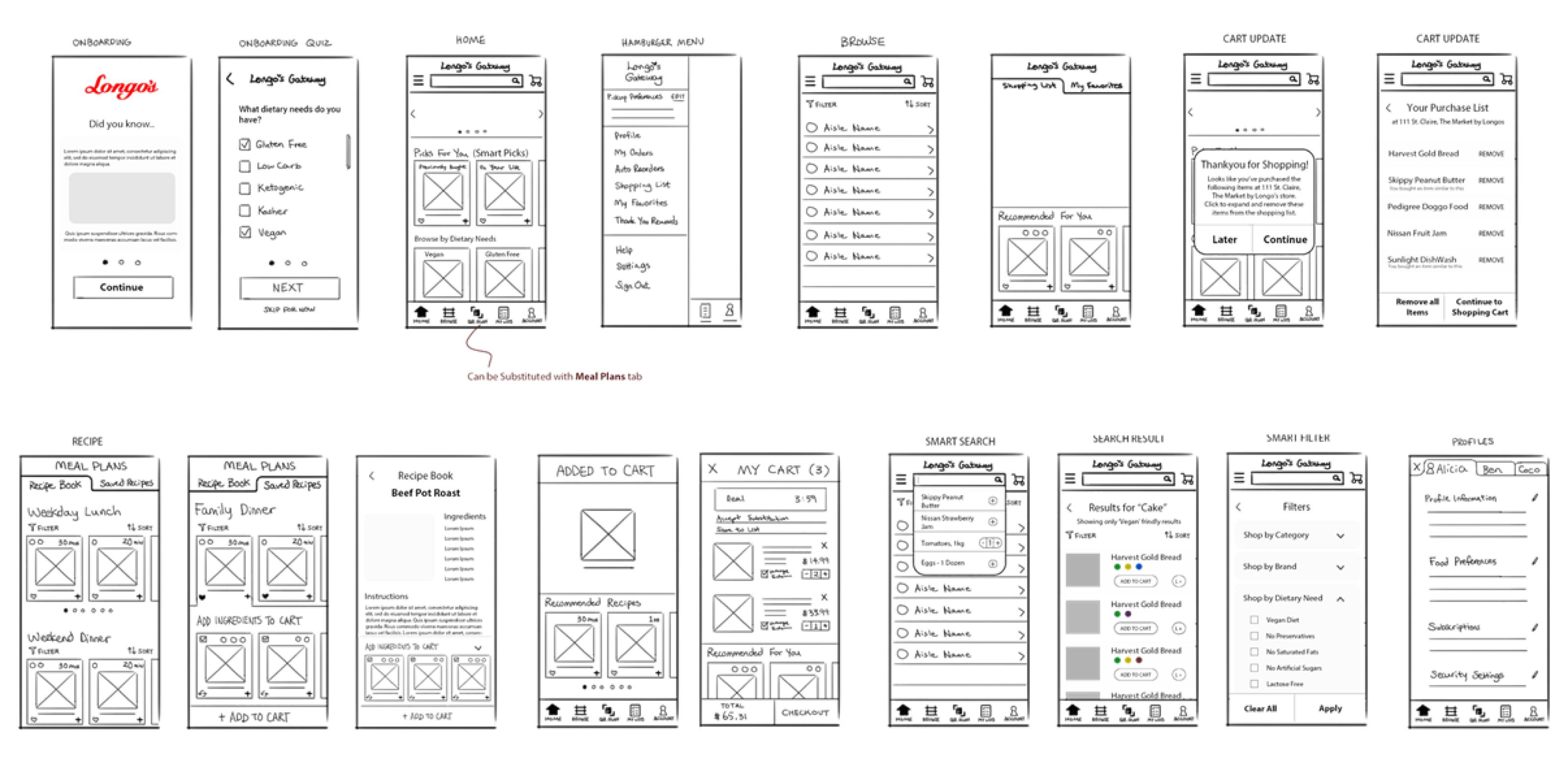
- Discussed each idea on the Big Idea board to identify its place on prioritization grid.
- Assumptions and Question activity was very helpful in rectifying how realistic each idea is, and what do we need in future to validate the rationale for the chosen solutions.
- By discussing and condensing the ideas into cluster of big ideas, we were able to have a more clear path of user-flows and wireframes.
- Plotting out task flows and visualizing the interface helped us determine the key paths and functions of our app
Day 4: Prototype
- The team began the day by reviewing our wireframe sketches, and sorting out the essential functions and flows.
- We assessed ourselves by our strengths and desired learning outcomes, and assigned the prototyping duties accordingly.
- Each task was pinned to a Kanban Board, so everyone can have an overview of which tasks are currently being done, by whom, and what still needs to be done.
- Everyone contributed to low-fi wireframes by completing different user flows.
- After the interactive prototype was completed, we tested every function and fixed simple errors, while making note of bigger oversights.
- A Playback was conducted at the end of the day to consolidate our learnings. We compiled a list of revisions to be made in the hi-fi prototype.
Kanban Board
Prototype Playback
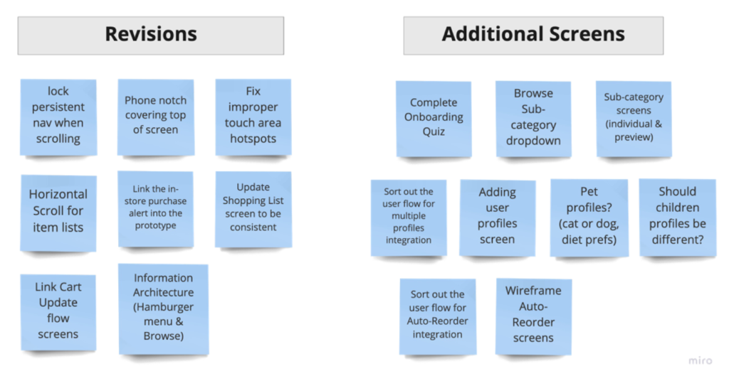
- Better Planning
Although we have ironed out the major functions of our app via sketches ahead of time, there were many things we hadn’t considered, such as the visual metaphors we’d be using for tabs, the complete flows for different tasks and which screens they’d entail. - Start Big
Focusing on the bigger picture i.e. the general flow and structure and less on details. - Design Coherence
We should have set up more consistent design standards across the app before creating the wireframes, and properly leveraged components.
Prototype Testing – Testing the prototype on different devices to avoid unanticipated issues. - Prototype Testing
Preview the prototype in both desktop and mobile mode on different devices, in order to ensure compatibility across a variety of situations so that we aren’t caught by surprise.
Day 5: Validate
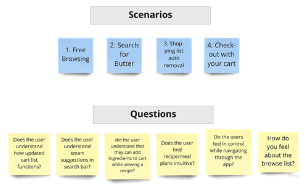
With our prototype completed, it was time to validate its efficacy via user testing. We discussed and wrote down a list of scenarios to guide the user through the experience along with a list of questions.
- We planned out a loosely structured interview to guide participants through user testing.
- Asked participants to use the think aloud protocol.
- We walked users through scenarios, and they provided feedback and insights beyond our original focus points.
- User feedback was synthesized via a feedback grid, informing us of our next steps
User Testing Guide
Scenarios
– Free Browsing
– Search for Butter
– Shopping list – auto removal
– Go to Cart – Checkout
Questions
– Does the user feel in control while navigating the app?
– Does the user understand how the updated cart list functions?
– Does the user find recipe planning intuitive?
Feeback Grid
Likes
“I really like the recipe section, that would be very useful for meal planning.”
Participants enjoyed the freedom afforded to them by features:
– Recipe ingredient substitutions
– Separate shopping lists
– Ability to auto-reorder grocery staples
– Different user profiles for different dietary preferences
Criticism
“I thought the camera symbol meant uploading a picture of defective products or searching by image”
Participants expressed their frustrations:
– Ingredient substitution feature is obtuse and confusing
– Checkout screen was cluttered and confusing
– Didn’t find the camera icon indicative of the barcode scan function
– Adding each recipe ingredient individually to cart is tedious
Questions
– How do I get back to the homepage? Hit back 4 times? (From the recipe page)
– Will I get confirmation notification from the app before placing each auto-reorder?
– Why are the items displayed under shopping lists tab?!
– How do I create a new shopping list?
Ideas
“I want the GG delivery to pack different shopping lists separately, even if delivered together.”
“I wish I could see the expanded (full page) view of all the ingredients required for this recipe”
User Testing Feedback: Categorized
Categorizing the feedback helped us to prioritize features and gave us a clear direction for fixing features that didn’t work.
High Fidelity Interactive Prototype
Problem
“How can we create a seamless in-store and online shopping experience for our guests?”
Solution
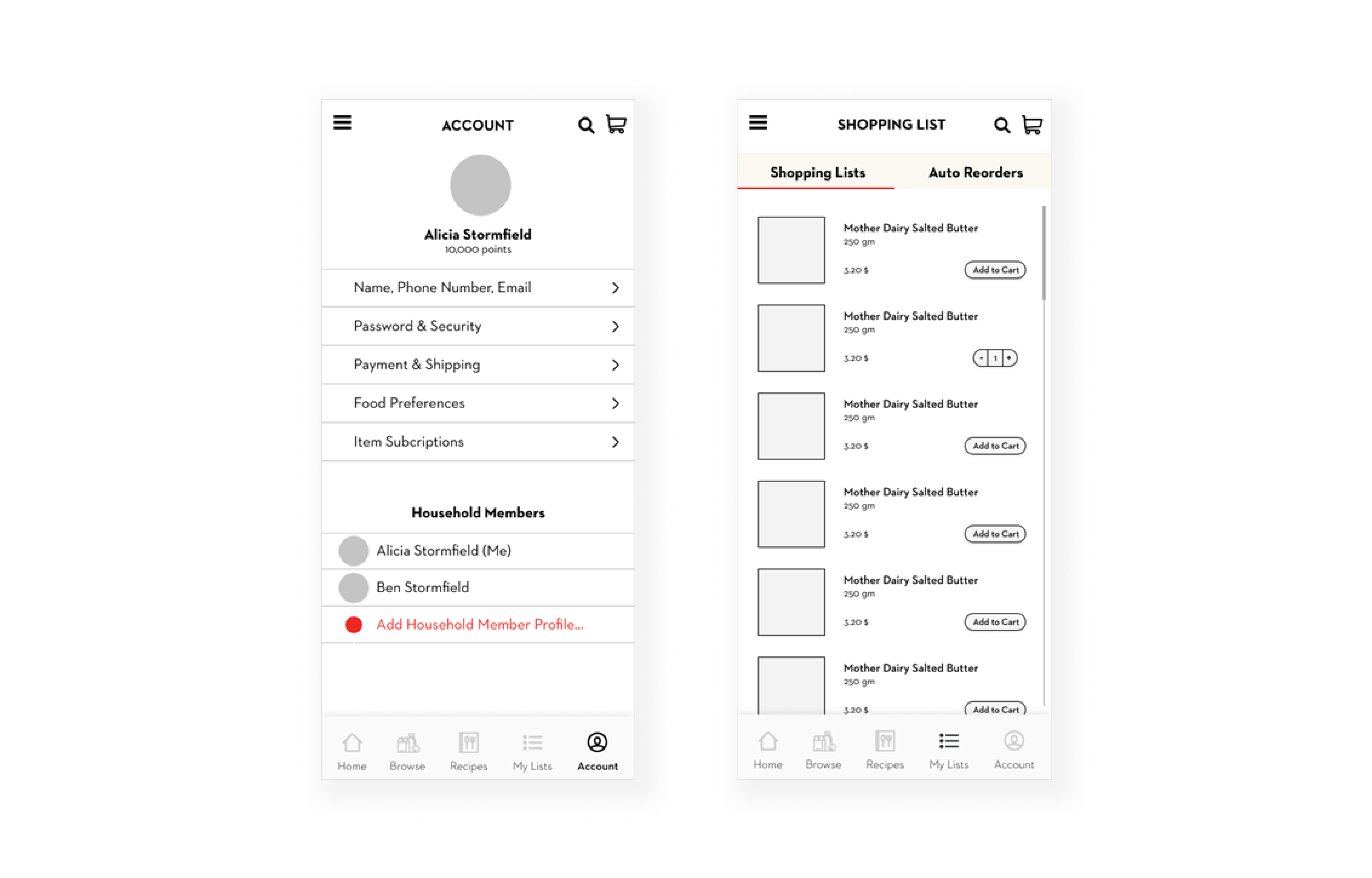
Weekly Musts: Auto reordering grocery staples
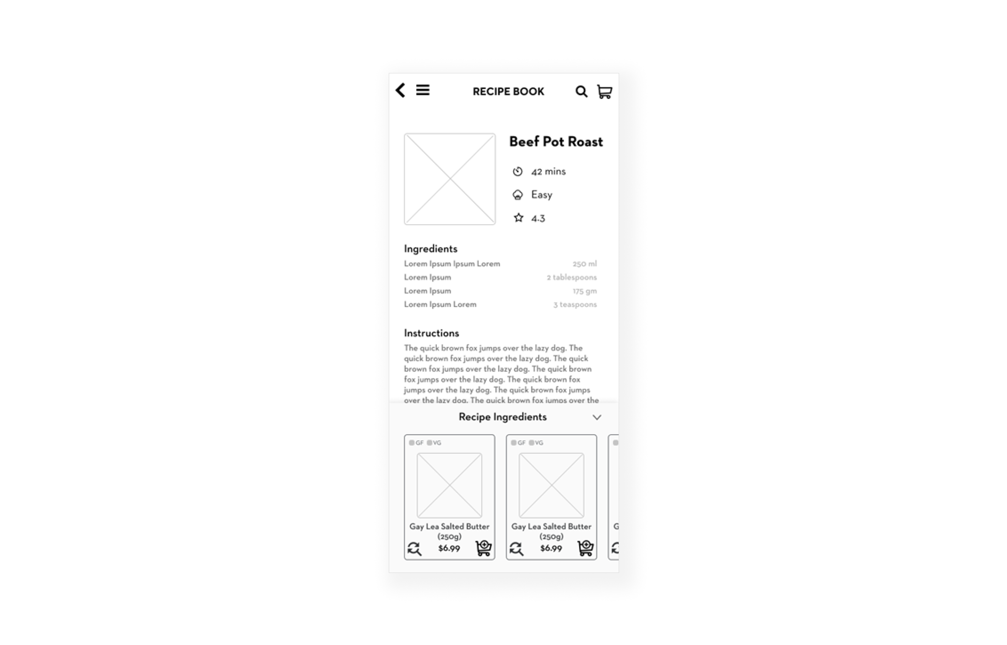
Easy meal planning: Tailored recipes
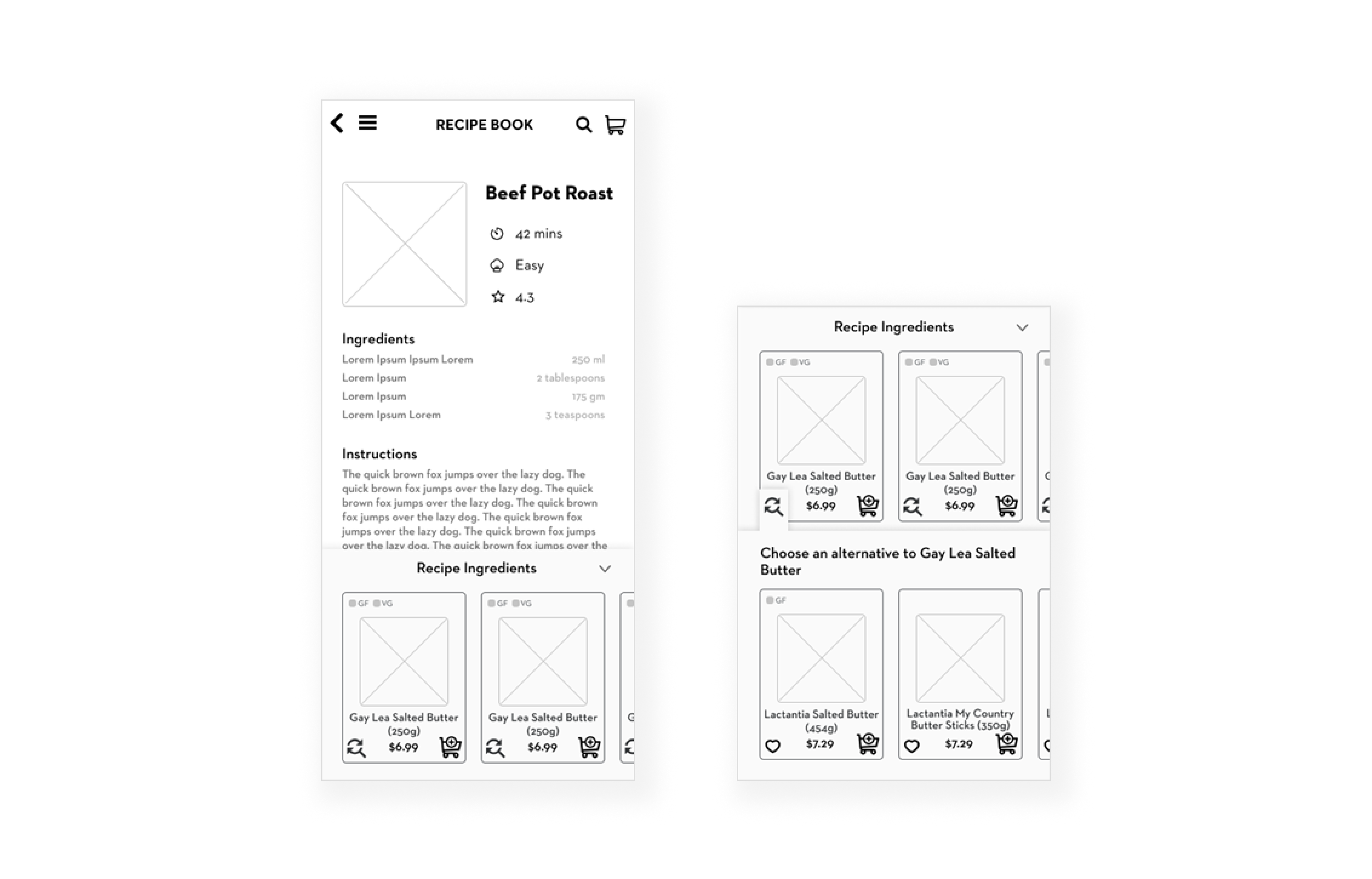
Smart item suggestions: Based on user’s individual dietary needs
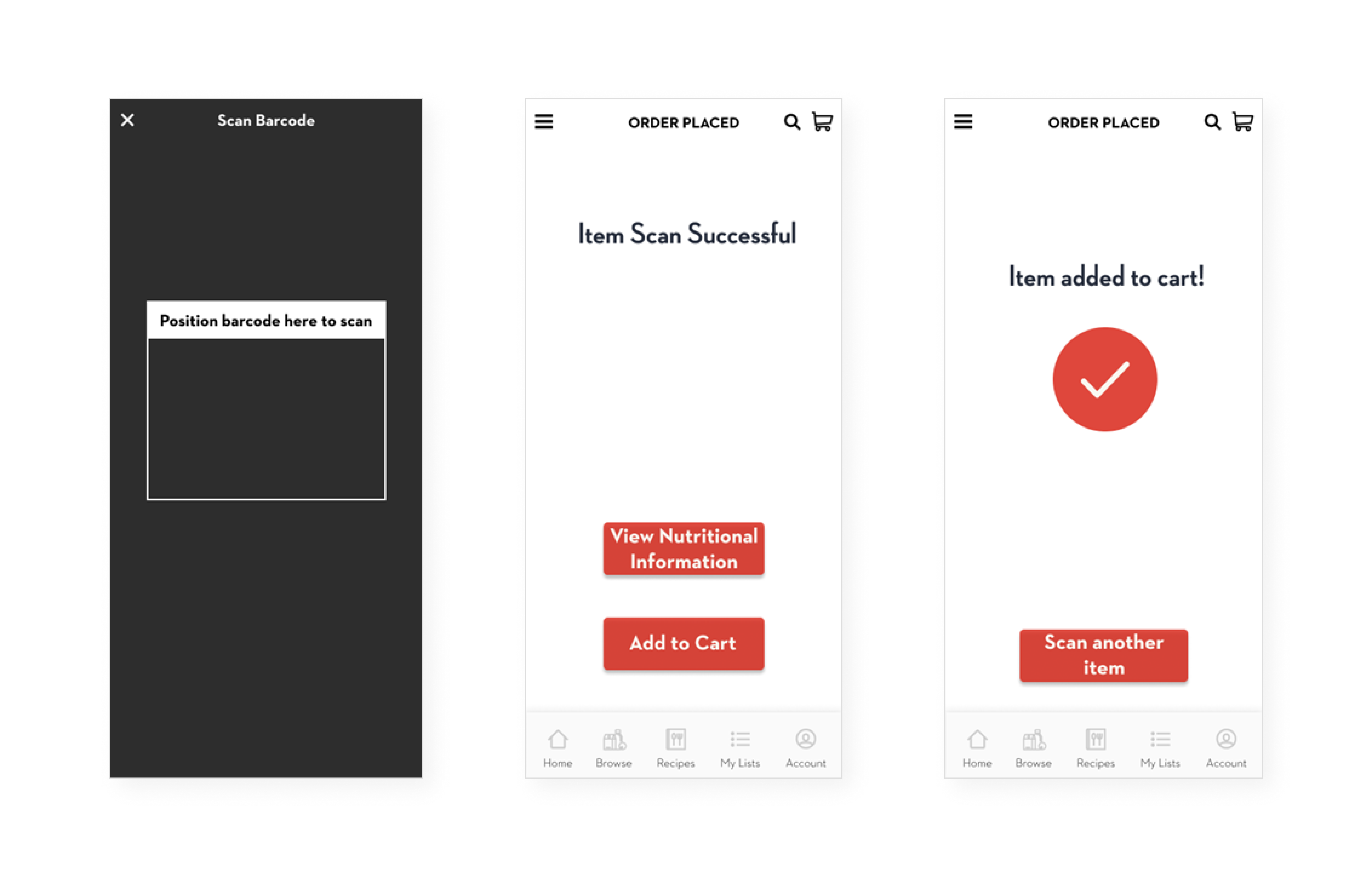
Missing items in-store: Scan barcode to add to online cart
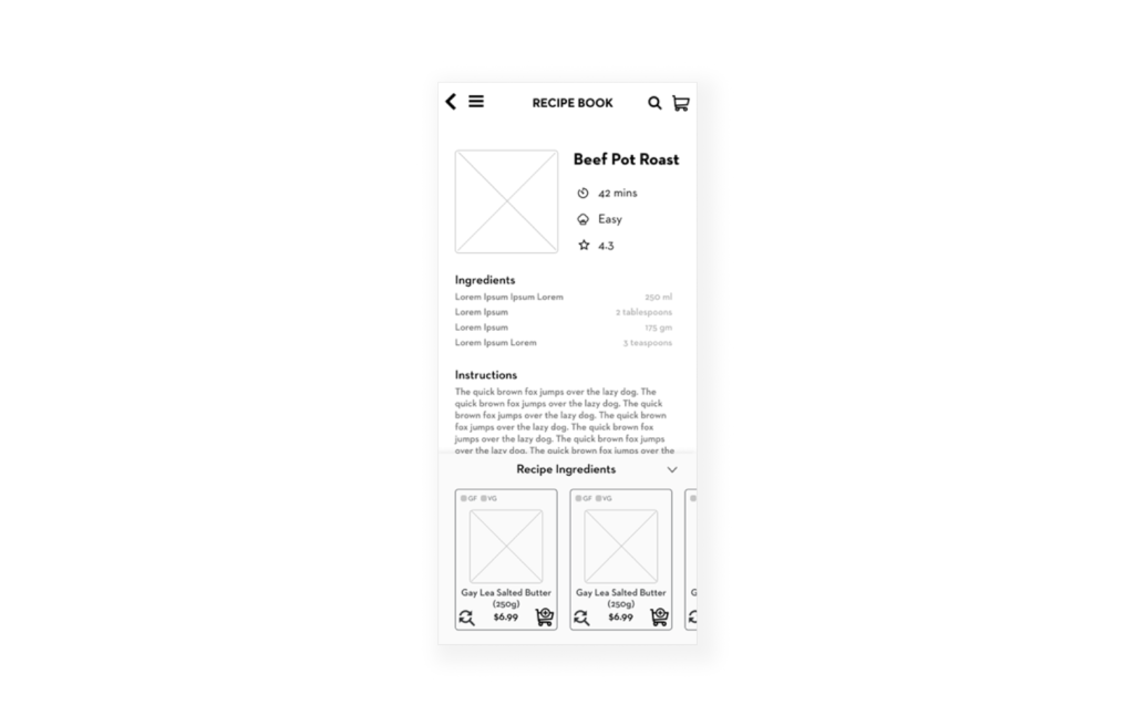
Smart Shopping List: Integrated with in-store purchases
Moodboard
Interactive Prototype
User Testing Feedback
With our prototype completed, it was time to validate its efficacy via user testing. We discussed and wrote down a list of scenarios to guide the user through the experience along with a list of questions.
Likes
“I really like the recipe section, that would be very useful for meal planning.”
Participants enjoyed the freedom afforded to them by features:
– Recipe ingredient substitutions
– Separate shopping lists
– Ability to auto-reorder grocery staples
– Different user profiles for different dietary preferences
Criticism
“I thought the camera symbol meant uploading a picture of defective products or searching by image”
Participants expressed their frustrations:
– Ingredient substitution feature is obtuse and confusing
– Checkout screen was cluttered and confusing
– Didn’t find the camera icon indicative of the barcode scan function
– Adding each recipe ingredient individually to cart is tedious
Interaction Design
Element of Interaction Design: Motion
Solution: Cognitive Offloading
The animated heart icon in red colour provides confirmation that the given item has been successfully added to their Wishlist by means of a visual feedback. Incorporating the motion element of feedback along with a red colour, it immediately catches the eyes of the users to inform them of the confirmation.
Instead of holding the items in their mind while shopping, users can go to back to the saved items and easily sort through which items they want to purchase.
Element of Interaction Design: Space
Solution: Barcode Scanner
Users’ interaction with the barcode scanner would allow them to interact with a combination of physical and digital space at the same time. It would also provide them with an animated signifier for using the feature as well as providing them with a cue for placing the object and scanning its barcode.
Law of Interaction Design: Tesler’s Law
Solution: Auto-Reorder
The Tesler’s Law or The Law of Conservation of Complexity, states that for any system there is a certain amount of complexity which cannot be reduced. The Tesler’s law is demonstrated in our Auto Reorder feature, which allows the user to reorder frequently purchased items conveniently. Auto Reorder is a complex feature, but it exists to serve the need of the user in easily and efficient reordering products.
Characteristic of Interaction Design: Lucid Playfulness & Pleasure
Solution: Smart Shopping List
We introduced a delightful playful animation for the users in a few task-flows within the app. One such example is, when the user gets a notification from the Smart Shopping Cart feature about their recent purchase at the Longo’s store they are prompted to remove the purchased items from their list. Upon removing the items from their list, a playful animation of an alien spaceship abducting an empty cart is displayed on the screen as a feedback that their cart is empty now.
Dimension of Interaction Design: Visual Representation
Solution: Intuitive Browsing Experience
The Grocery Aisle List and Recipe under browse section consists of thumbnails that helps the user to identify different categories quickly. The thumbnail images are bright and adhere to a consistent style. The information architecture of both features were carefully thought out and organized in most intuitive way.
Dimensions of Interaction Design: Words
Solution: Smart Shopping List
Grocery Gateway’s current Favourites feature actually functions as a system generated Frequently Bought list, and not a feature users have direct control over. To align with UX best practices, the function has been renamed to Frequently Bought, and moved to the home screen. In the absence of smart suggestions, this will allow it to function both as Recommendations & a way for users to easily view their common purchases without navigating to another screen.
Items “hearted” by users are aggregated into a list renamed as Wishlist, as this is consistent with UX conventions & user expectations.
My Lists has been renamed to Shopping Lists to better differentiate its function from Wishlist.
Retrospective
Our MVP is a complete solution for common issues faced by Longo’s guests:
- Better integrated auto reorder feature
- More intuitive lists
- Hooks placed in the physical store paired with Barcode scanner feature in the app
- Smart lists and auto removal of items feature
What worked well?
- Rapid Ideation: The compressed sprint process allowed us to quickly ideate and test our solutions, without being too attached to one idea.
- Know our stakeholders: Our team researched Longo’s and prepared questions for both their UX lead and store managers, thus learning the business perspective from our stakeholders.
- Eye Tracking: We took initiative and proposed the use of eye tracking equipment during participant interviews. So we were able to witness the user’s perspective and better empathize with them, gathering first-person valuable data.
- User Testing Feedback: Our user tests were largely successful and yielded valuable and unexpected insights, thanks to our loosely structured approach.
What needs improvement?
Our team struggled with time management initially. Spending too much time on each activity caused us to be burnt out quickly and the quality of work declined towards the end of the day. We resolved the issue through issue through strict time boxing.
We felt the 2 user interviews we conducted was too small of a participant pool for fair insight.
Our inexperience the sprint process made us take things one day at a time, which inevitably resulted in some myopia. We didn’t plan for the participant recruitment portion of user testing, which affected the quantity and quality of the participants recruitment.
Additionally, we didn’t prepare for unexpected situations by testing the prototype on different devices, the notch on certain phones block the content on the very top of the screen.

